A More Material Way Of Bottom Navigation Scaffold In Flutter
2020-12-30tl;dr If floating action button (FAB) transistion animation is complained by UX desinger not matching material design, you can try my new scaffold (here) to make your life easier in this exact situation.
Background
While I prefer to an implemenptation of elements transistion in bottom navigation as in my previous article, I found Material design said something different in similar situation.
Tabbed screens
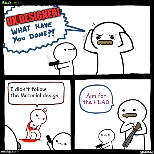
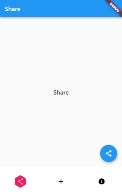
When tabs are present, the FAB should briefly disappear, then reappear when the new content moves into place. This expresses that the FAB is not connected to any particular tab.
You may argue that bottom navigation is technically not tabbed screens, and the floating action button should be assoicaited with that particular screen...
UX designer may still prefer this way.
To archive this, the pages and corresponding floating action buttons are separated, and the widget tree would be something like the following.
As the previous article points out, this requires a lot of extra code. Is there a way to get rid of them?
A Way Out
Besides copy and paste from my previous article, you can take my package bottom_navigation_scaffold hosted on pub.dev.

Basic Usage
1. Add package
dependencies:
  bottom_navigation_scaffold: ^0.0.1
2. Add the widget from package to root screen
import 'package:bottom_navigation_scaffold/bottom_navigation_scaffold.dart';

// usually in build method

  return BottomNavigationScaffold(
    bottomNavigationBarBuilder: (context, tabs, currentIndex, signalUpdate){},
    pageDetails: [],
  );
3. Declare the page content, tab, floating action button (if applicable) and app bar (if applicable) for each page
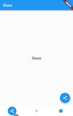
pageDetails: [
  PageDetail(
    pageAppBar: AppBar(
      key: Key("share"),
      title: Text('Share'),
    ),
    page: PageWidget(title: 'Share'),
    tab: BottomNavigationBarItem(icon: Icon(Icons.share), label: "Share"),
    floatingActionButton: FloatingActionButton(
      key: Key("share"),
      onPressed: () {},
      tooltip: 'Share',
      child: Icon(Icons.share),
    ),
  ),
  PageDetail(
    pageAppBar: AppBar(
      key: Key("add"),
      title: Text('Add'),
    ),
    page: PageWidget(title: 'Add'),
    tab: BottomNavigationBarItem(icon: Icon(Icons.add), label: "Add"),
    floatingActionButton: FloatingActionButton(
      key: Key("add"),
      onPressed: () {},
      tooltip: 'Add',
      child: Icon(Icons.add),
    ),
  ),
  PageDetail(
    page: PageWidget(title: 'Info'),
    tab: BottomNavigationBarItem(icon: Icon(Icons.info), label: "Info"),
  ),
],
4. Add the bottom navigator bar
If not using the tab bar widget, remember to call the method signalUpdate to refresh the floating action button and app bar.
bottomNavigationBarBuilder: (context, tabs, currentIndex, signalUpdate) {
  return BottomNavigationBar(
    onTap: signalUpdate,
    items: tabs,
    currentIndex: currentIndex,
  );
},
⚠ Since this comes with a scaffold, do not add your own scaffold, or you will run into multi-scaffold troubles.
Use with other bottom navigation bar
The default bottom navigation bar is too bored for you app? No problem, this scaffold provides the freedom for you to use other bars.
SnakeNavigationBar
SnakeNavigationBar can be used directly as it's example in the bottomNavigationBarBuilder.
  bottomNavigationBarBuilder: (context, tabs, currentIndex, signalUpdate) {
    return SnakeNavigationBar.color(
      currentIndex: currentIndex,
      onTap: signalUpdate,
      items: tabs,
    );
  },
rolling_nav_bar
For rolling_nav_bar, its example provides most of the parts you need, and in here the IconData is used directly in tab for PageDetail since it don't use BottomNavigationBarItem.
⚠ As its example, the
RollingNavBarneeds to be wrapped aContainerwith height specified.
bottomNavigationBarBuilder: (context, tabs, currentIndex, signalUpdate) {
  return Container(
    height: 95,
    child: RollingNavBar.iconData(
      onTap: signalUpdate,
      activeIndex: currentIndex,
      iconData: tabs,// nav items
    )
  );
},
pageDetails: [
  PageDetail(
    pageAppBar: AppBar(
      key: Key("share"),
      title: Text('Share'),
    ),
    page: PageWidget(title: 'Share'),
    tab: Icons.share,
    floatingActionButton: FloatingActionButton(
      key: Key("share"),
      onPressed: () {},
      tooltip: 'Share',
      child: Icon(Icons.share),
    ),
  ),
  //...
]
Closing
Now you have an easy way to implement bottom navigation in a more material design way.
If you like this package, remember to star it in GitHub and like it in pub.dev.
If you like this article, remember to show your support by buy me a book.